|
|
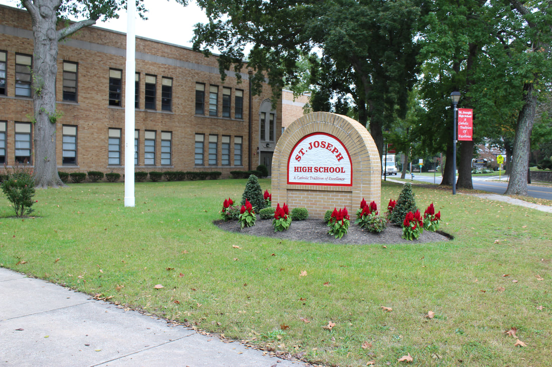
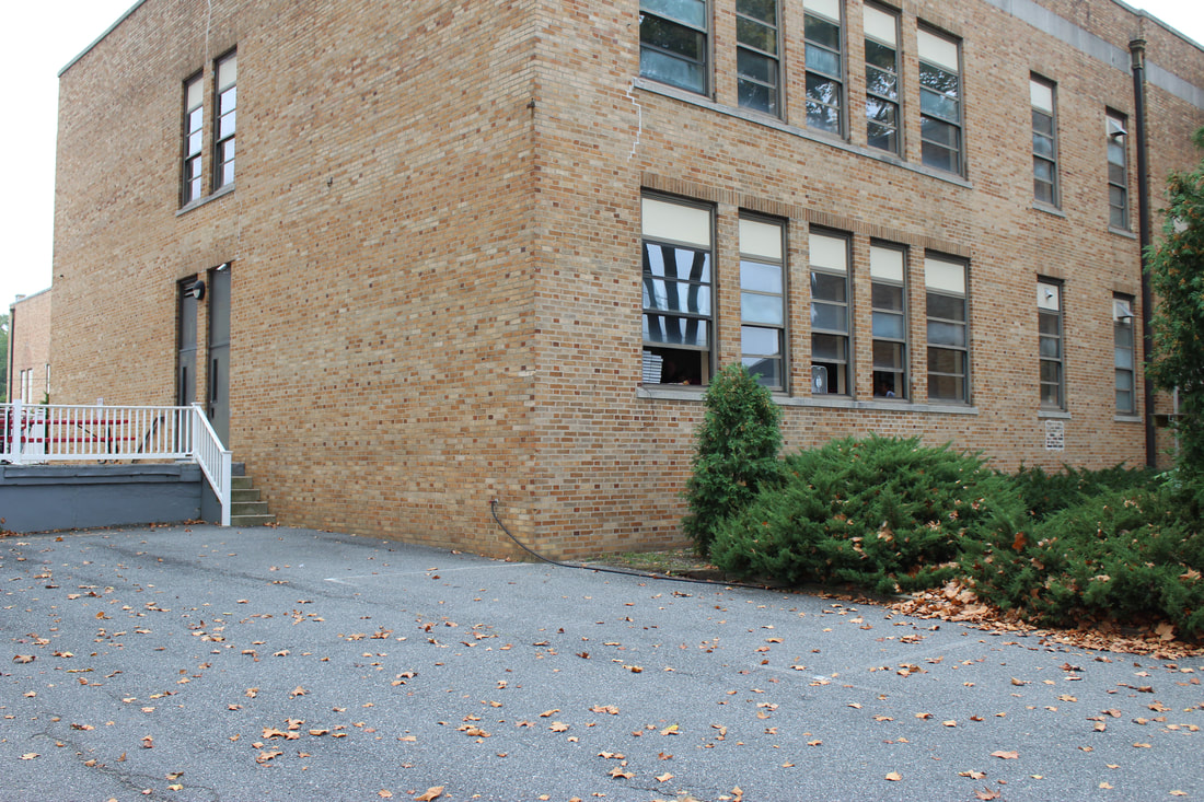
The photo on the left has a clear focal point, while the photo on the right has none at all. The focal point obviously makes the photo much more appealing. The school looks drab and dreary in the photo on the right, but it looks bright and spirited in the photo on the left. I chose the St. Joseph sign as my focal point because it is a signature part of the school.
